Selected texts and reviews


The Reenchantment of Painting : New Work by Sharon Hall
In the wider context Sharon Hall’s exhibition of smallish abstract paintings could be said to instantiate, even celebrate, the notion of ‘material culture’. Decisions about the dimensions and proportion of the stretchers, the choice of linen, cotton duck or panel for the support, the number of coats of gesso required for the ground, the selection of acrylic or oil pigment, from stain to impasto, embed her practice in the tangible and practical world, with methodologies developed to manage ‘stuff’ into significance
In front of Hall’s work attention is focussed on the way the constituent substances operate and interact. This experience contrasts with what is offered in the virtual realm of the metaverse, which dominates contemporary culture, making material objects appear exotic or primitive. Not only are Hall’s works decidedly material, they are paintings, and particularly flat paintings at that.
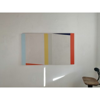
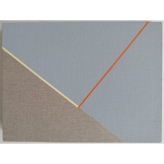
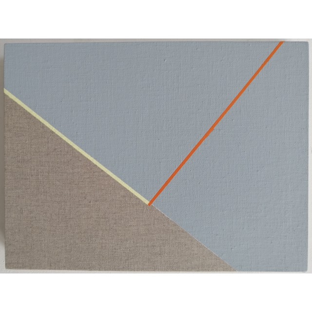
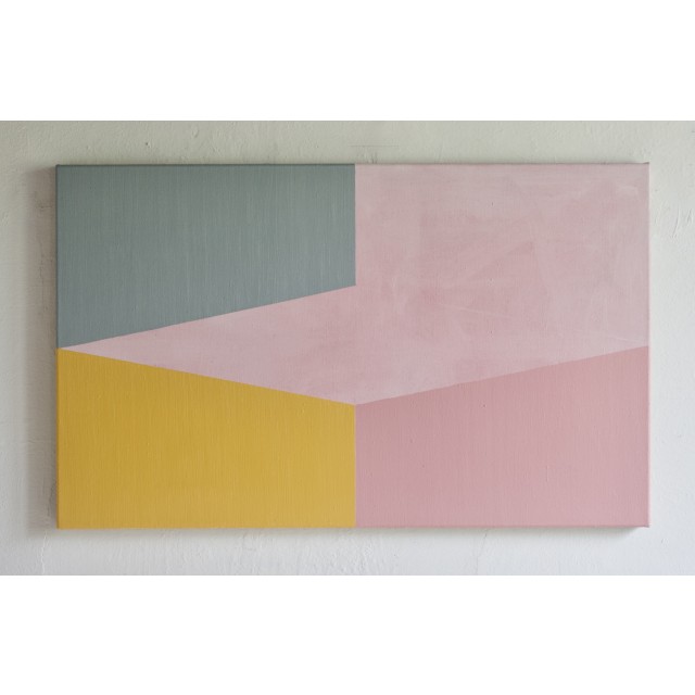
[..] But the most obvious aspect of Hall’s recent works, like ‘Turning’ (2024), ‘Touch’ and ‘Across’, is their visual impact. Their chromatic vibrancy is generated by the compounded accumulation of glazes in which colour seems to condense level with the picture plane. This primary address to the eye is deliberate and part of the works’ aesthetic policy. They are intentionally beautiful. I’d like to suggest that this move can be linked to what might be called the ‘re-enchantment’ of painting,
What do I mean by this term? The visual language of non-objective painting; the point, the line and the plane, which has been around for a century, is the result of the modernist process of ‘disenchantment’. Amongst the properties of painting that were deactivated were figuration, illusion and the notion of beauty. These were the sources of enchantment. The viewer was under the ‘spell’ of pictorial space, or ‘in thrall’ to beauty, and both of these reactions seemed, to the modernists, problematic or nostalgic.
What’s interesting about Sharon Hall’s recent paintings, as I see them, is that they contain both the structures of disenchantment, which govern geometric abstraction, and the potential for re-enchantment, wherein illusion is admitted and aesthetic appeal is maximised.
David Sweet
2024
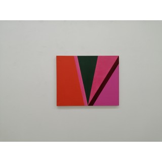
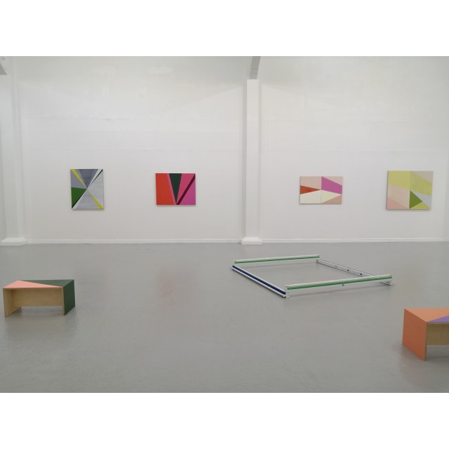
Meeting Points Review
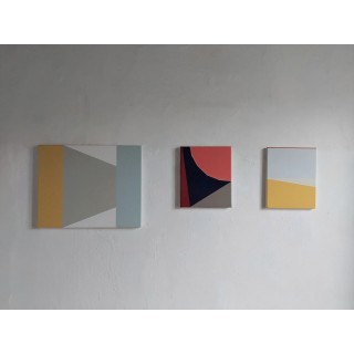
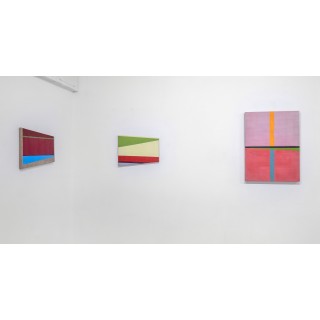
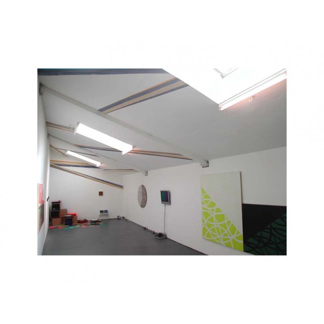
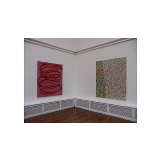
n Sharon Hall’s absorbing exhibition ‘Meeting Points’ at Benjamin Rhodes’ gallery, a deep understanding of colour permeates the work. We feel drawn into the possible locations, or passages of time, which the conception of the show alludes to. But alongside this aesthetic there is a coalescence that exists between the works, building an odd luminescence that creates a slightly unsettling atmosphere in the space.
Hall’s complex arrangements of angles and spatial relationships construct an approach to tone, texture, and permeability which emphasises the surface facture, which varies according to the support they are painted on, or where they are painted. The different sections of the show cleverly solves this formal problem for the audience. But Hall is unafraid of questioning the hard-edged nature of her work, bringing expressive moments to her precise forms, and a fluid mutability to the exhibition.
Each of these paintings operates in a multitude of ways. In Asymmetrical I & II the sharply-divided panels have one colour (lime green) carried over. But here Hall takes it through a gentle metamorphosis, changing its nature as it crosses, letting light into the painting by wiping or glazing. The brushy sections function differently enough to activate the flatter applications of fresco-like colour in the left-hand panel. The adjacent composition, with its cadmium green triangle is activated by its flickering sense of focus, optically pointing the viewer in different directions depending on their angle of view.
[..]
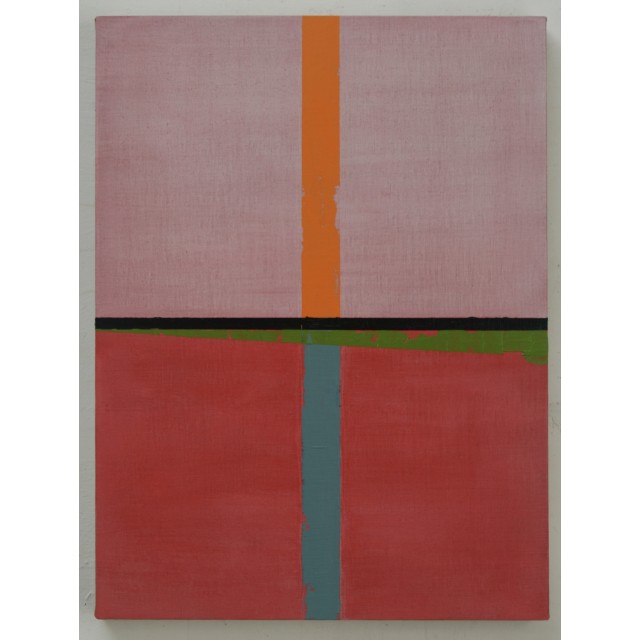
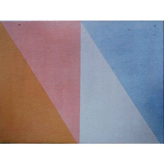
Turning a corner within the space we are confronted with another stunning diptych: Pinks, Whites and Orange. This hard-edged composition offers several ways to enter the system contained within its gradually increasing expansion. We notice a hidden trapezoid constructed from the magenta and off-white forms, then suddenly find another – nestled inside and balancing the other panel. This painting deals brilliantly well with the emotions of the audience, developing an autobiographical mirror. Hall’s love of travel and movement is infectious and inspiring.
Hall divides her studio time between London and Italy, and this duality is at the core of these paintings. But more radically, the extraordinary pitch that has grown out of her time in Varanesi has brought a fragility to her paintings’ structure. Perhaps letting in more air, and bringing a kind of poignancy to the temperature of her paintings’ transient and mobile relationships.
Laurence Noga
2024
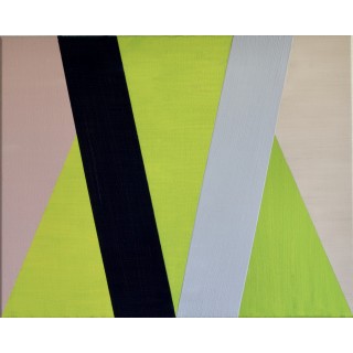
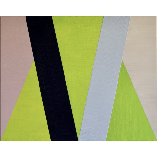
Meeting Points review
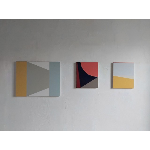
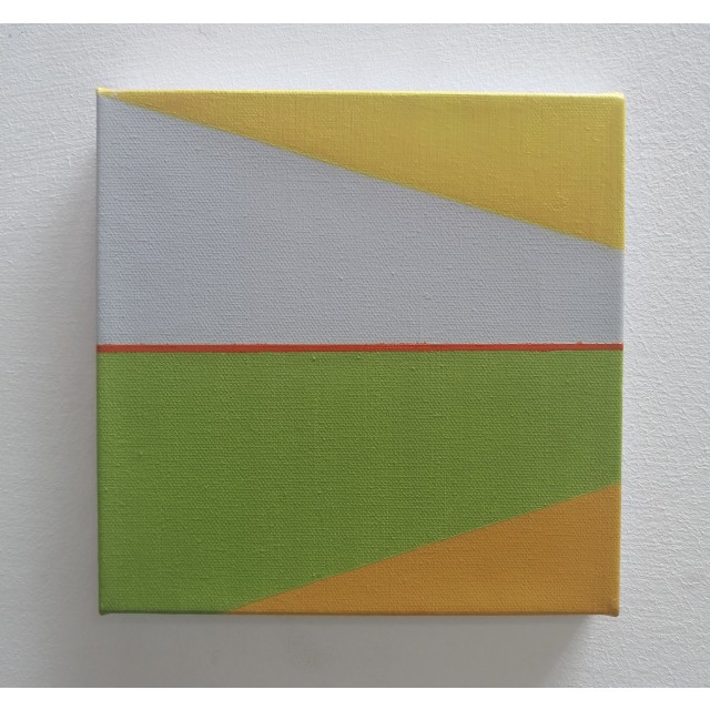
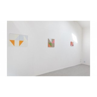
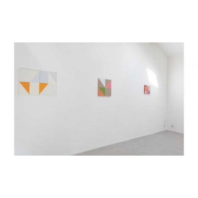
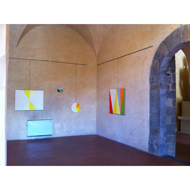
Sharon Hall has an exhibition at Benjamin Rhodes Arts a show perfectly named, a show called Meeting Points, there’s this one gorgeous painting where she has everything just so right, that isn’t to pour scorn on the other pieces in this fine show, but that one painting just has ‘it’. You need to see, you can’t catch the freshness in the catalogue reproduction or in any of the photos on line, you can’t get the zest of those greens, those lines, those edges, those meeting points, a painting called Across, a painting that just feels so alive, so right – the painting is only 40x30cm and it not even on one of the main walls of the small gallery, there it is modesty hanging to the side while the others grab the spotlights but it is a painting so so right, so beautifully refreshing, so so right there and the thing is it isn’t that different to any of the other paintings in the show but it is just so so right. The whole show feel right. I mean normally, an exhibition of paintings of this nature wouldn’t really do much for me but a fine line has been crossed here, is it her intuition? Her sense of the right amount of colour in just the right place? The discipline of it? The indiscipline and the let’s try and see maybe? The finding out? The calm of it all? Each of these paintings work so well within the space of the canvas, something about the economy of it all, mostly something about intuition. Meeting Points is on until June 29th at Benjamin Rhodes Arts. [..]
Sean Worrell
2024
Meeting Points, Benjamin Rhodes Arts London
Studio Visit
Hall has a strange relation to exactitude, as always. Her intuitive use of risk and knowledge, as well as her continuing contrary fight against visual logic, creates a sense of progression in terms of decisions made during the working process. Instead of producing an iconic image, however, Hall waits for accumulative effect, or effects, to work, just about. Such an approach to time, allows the irregular broken triangle to exist, with the artist still wondering if this might work. Working within the apparent confines of physical space, the artist, does break out at times, with the stretcher and recent watercolours, for instance, mimicking an extended cinema screen that curves away from us.
While there is something calming about the artist being openly present in the work the rationale of language soon breaks down, nonetheless. While a certain type of hard-edged painting will try to deny the fallible nature of hand or fact, even the masking tape here helps to act as supporter of process rather than hidden component of artifice. Hall indulges lightly in a build-up of intelligent, non-volumetric areas of soft, diffuse, sometimes powdery colour, that seem to go beneath or become part of the surface. At times the paint appears to be no more than a delicately expanded stain or filter. Moving through, however, apparently questioning the situation, Hall renders another area strangely opaque. The undeliberate surface of the green triangle, for instance, which sits awkwardly in front, with the ‘used’ or ‘found’ colour absorbed in the surface next door, forces the eye to adjust to differing circumstances. Hovering or sitting on top, the opaque section almost mimics the faux nature of the whole endeavour. Hall remains somewhat anti expressive in her use of paint. She has, for decades, been making independent work which deals openly with received ideas of language, reproduction, and the huge gamut of expectation and association that comes with visual language.
Each and any real image lies in the role that is more tantalisingly fact than illusion, starting with a number of decisions made ‘as I go along’, Hall utilises an open-ended pull of precarity. A matter of finding where things might seem to surprise or confuse, in each imbedded, complete painting seems to render the familiar unfamiliar, or the other way round. While Hall’s apparently contrary notions might suggest a campaign of extensive wrong-footing, this is not the point. Pink and yellow, so deep but filling the space, start to represent a state where colour is nothing other than what it is. Suggestive of a place that exists in much earlier painting, the work creates a strong sense of actual existence. Odd things do happen, and things are able to remain still, in a fixed state, perhaps.
Sacha Craddock
April 2024
Meeting Points, Benjamin Rhodes Arts London
Charged Presence
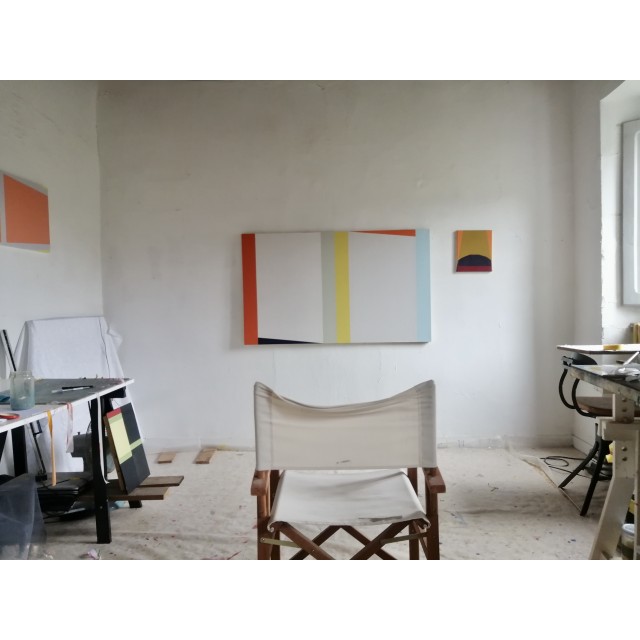
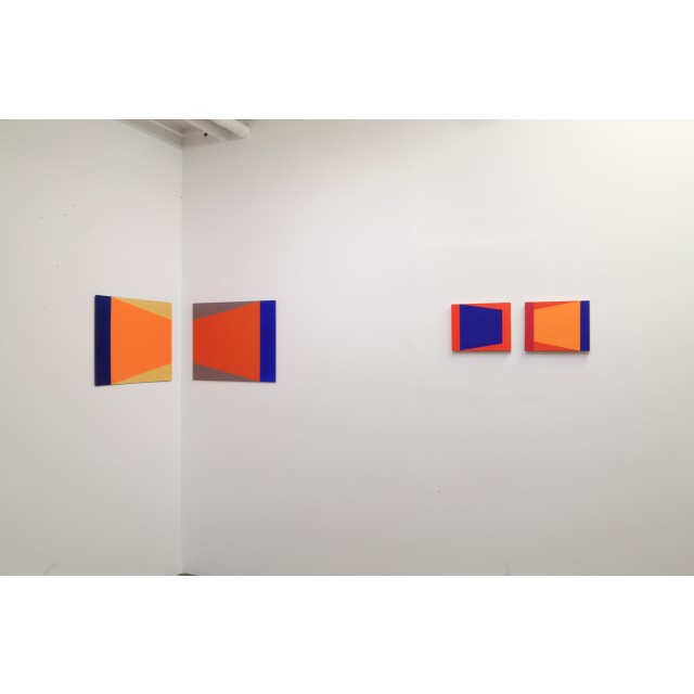
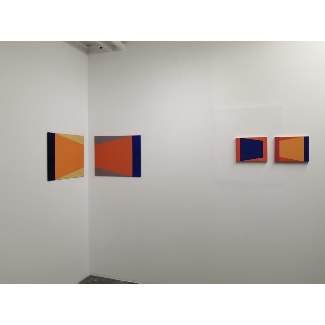
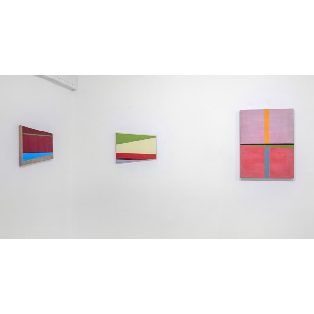
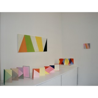
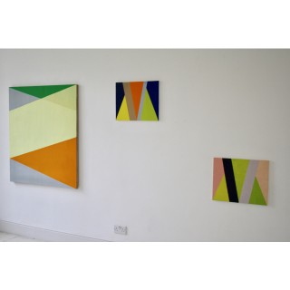
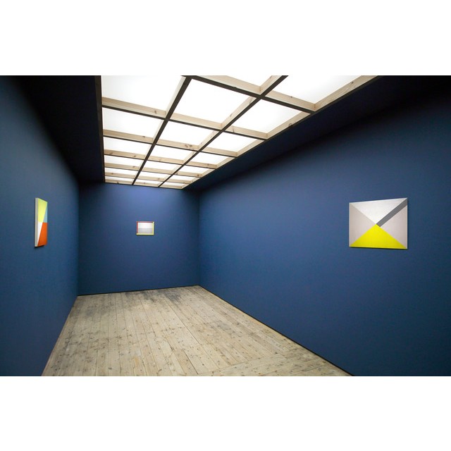
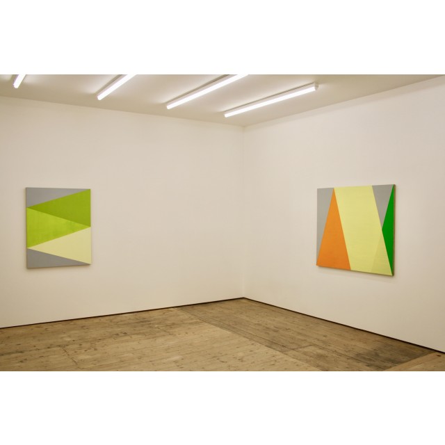
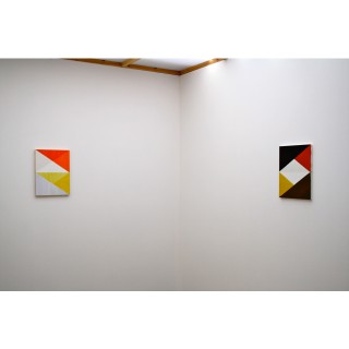
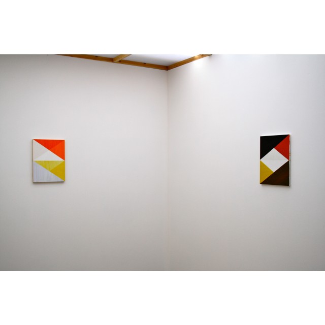
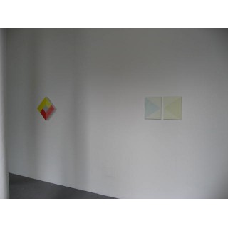
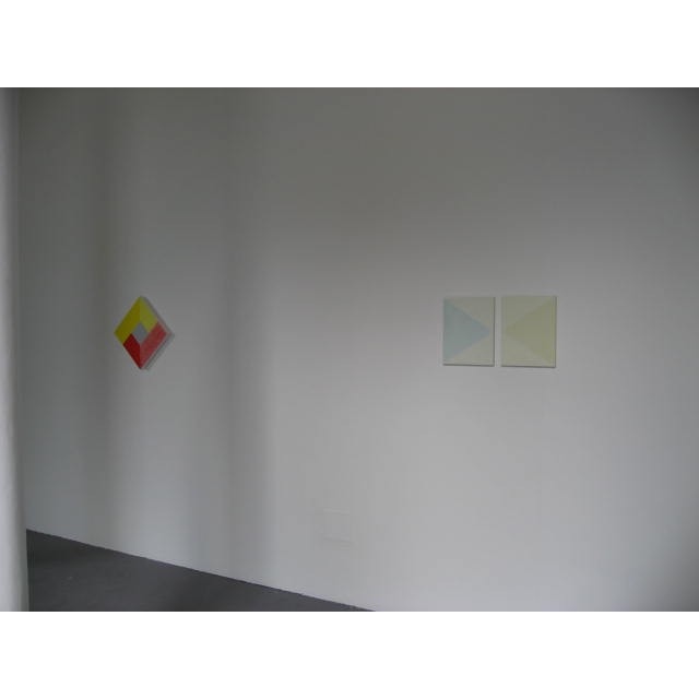
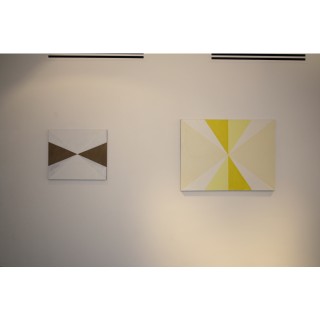
The first thing to say about Sharon Hall’s paintings is to note how they operate in a sympathetic space. Large paintings tend to radiate outwards and dominate their surroundings. Small paintings, as most of Sharon Hall’s are - provided that they are sympathetically hung and given enough wall space - more often than not bring that space into play and activate it in what can feel like a low-key, visual gravitational field. This general effect is reinforced in many of the recent paintings by the fact that they are structured – with surfaces divided by clear vertical, horizontal and diagonal divisions – around the basic fact of the rectangularity of the canvas, which in turn relates to the much larger rectangle of the wall on which they are hung. To walk into a space in which these paintings are shown is to sense the charge of their presence. They may be discrete and self-contained, but when exhibited these works operate in a space which extends outside themselves.
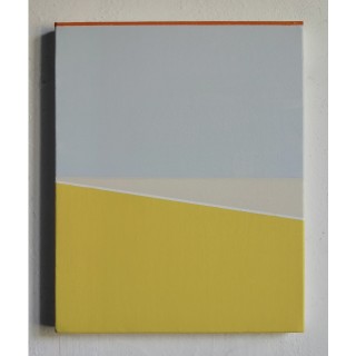
Over the years the use of colour in Sharon Hall’s work has changed. The unifying sense of light emerging from sometimes dramatic contrasts of tone and colour in works from a few years ago has become modified – perhaps more defined, certainly more pervasive - as colours have become increasingly nuanced and glazes have been used to create wider and more subtle spatial effects. There are paintings in which muted, opaque colours butt against each other, their relationship sharpened by contrasting wedges of luminous paleness; and there are others in which the light emanates from beneath the paint and through layers of glazed colour to create indeterminate spaces. In both cases the atmospheric quality of the colour offers a contrast and counterpoint to the incisive divisions of the canvas and the surface-emphasising way in which the paint is brushed. Tensile surfaces and translucent depths are brought into play, with edge-defining bands of stronger colour giving definition when needed. Hard-edged areas are infused with atmospheric colour to produce an overall effect of painterly orchestration. These recent paintings are the works of someone so experienced in her medium – so in control of her resources - that she can use it to create works which are not only compelling in themselves but which, when they are shown, can magnetise the spaces around them.
Stuart Bradshaw
April 2024
Artist's statement
I am interested in the instability of colour and the viewers participatory involvement in reading a painting – its atmosphere or sense of space that sometimes suggests a shallow illusionism-influenced in part by my encounters with the many trompe l’oeil devices employed it Italian wall painting from Roman times through to the quattrocento.
I use colour intuitively, getting a sense or feel for how a painting might develop so in this way each work is essentially open ended- they are not planned or filled in but arrived at through the internal dialogue with their making developing a conversation with each part within the painting- how colours relate and sit next to each other, the spaces or they might suggest sometimes literally physical spaces with semi raised shelves or bands of accent colours: highlighted edges etc
in 1977 I saw the first major show of Agnes Martin in the UK, at the Hayward Gallery. Together with a developing interest in the optical theories of George Seurat these two probably quite assonant strands helped me to develop the abstract paintings which I made as an undergraduate and subsequently post grad student at the Slade School in London. From this point onwards and during the eighties and 90s my work moved between all over colour fields which used inserted political imagery to what became eventually purely abstract paintings using’s firstly loose gestural drawing and then eventually more architectural structures derived from the grid. The grid still functions in part in my current work, but I am not tyrannised by it, and I often move deliberately to subvert and surprise the viewing ‘logic’. I feel I have developed three simultaneous themes or approaches to the construction of my painting’s and I am quite happy to let these different strands co-exist. The only real constant I can say is definitive is the overriding interest in the interaction of colour and what happens when they are placed in closeness to each other- confirmed by my early exposure to the Albers book when I was still an undergraduate and very recently in a conversation, I was lucky enough to share with Bridget Riley in Rome at the opening of her ceiling painting at the British School there.
The experience of colour as narrative has been a thread that runs through my work and important colourists artists such as Joseph Albers, Bridget Riley, Sol Lewitt, Anne Truitt, Brice Marden, Kenneth Noland, Dorothea Rockburne, Gene Davis and Ellsworth Kelly continue to be major influence in my thinking and painting practise.
Most recently I have been using a deliberately, shallow formal space with elements sitting in front of or behind each other. The overall unity within the pictorial architectonic is very important to me but I do not want the paintings to sit too comfortably and often they employ a kind of twisted to constantly shifting perceptual space to make them more active and deliberately awkward.
Very recently I have begun experimenting with lopsided and shaped canvas supports.
Sharon Hall
2023
Conversations in Colour
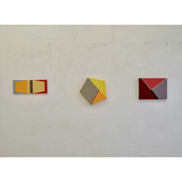
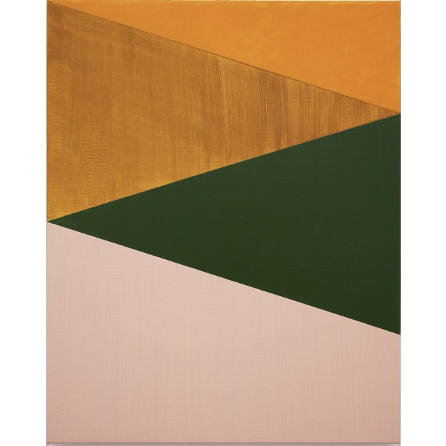
Abstract painting with a geometric conception, this is how we could define Sharon Hall's artistic practice. But this label fails to fully convey the final results achieved by this English painter. In fact, her paintings have a special freshness. If the starting intention seems to be to build works in which the division of spaces is regulated in a very exact and rational way, the final outcome is surprising because it possesses a fascinating visual softness, evident when looking at her works not on the screen of a computer, but live, when it is possible to savor the velvety concreteness of the colours. The colours, in fact, which in each canvas are combined with great accuracy: they occupy contiguous monochrome sectors and interact with each other intensely. This conversation of colors takes place in every single work of Sharon Hall, it is a dynamic that represents the soul of her paintings. Warm shades - red, green, orange, yellow - spread over the canvases, creating a comforting effect, releasing their quiet intensity. These works contain a very stimulating contrast. An exact grid is always present, a rigorous division of space, but this rigidity of the forms is modified by the colors that inhabit these boundaries, created and combined with masterly sensitivity.
Pittura astratta di concezione geometrica, potremmo definire così la pratica artistica di Sharon Hall. Ma questa etichetta non riesce a rendere pienamente i risultati finali a cui arriva questa pittrice inglese. I suoi quadri infatti sono dotati di una freschezza speciale. Se l'intenzione di partenza sembra quella di costruire opere in cui la divisione degli spazi è regolata in modo molto esatto e razionale, l'esito finale sorprende perché possiede una affascinante morbidezza visiva, evidente quando si guardano le sue opere non sullo schermo di un computer, ma dal vivo, quando è possibile assaporare la concretezza vellutata dei colori.
I colori, appunto, che in ogni tela sono accostati con grande accuratezza: occupano settori monocromi contigui e dialogano fra loro intensamente. Questa conversazione dei colori si svolge in ogni singola opera di Sharon Hall, è una dinamica che rappresenta l'anima dei suoi dipinti. Tonalità calde- rosso, verde, arancione, giallo- si distendono sopra le tele costruendo un effetto confortante, sprigionano una loro quieta intensità. Queste opere contengono un contrasto molto stimolate. E' sempre presente una griglia esatta, una suddivisione dello spazio rigorosa, ma questa rigidità delle forme viene modificata dai colori che abitano questi confini, creati ed accostati con magistrale sensibilità.
Galleria Stanza 251
2023
The Power Art #72
Each colour section has its own character and communicates with its adjacent neighbours, developing an innermost dialogue. These perceptions are enhanced through Hall’s use of bright and vibrant colours. Instinctively hard-edged painters like Frank Stella, Ellsworth Kelly and Joseph Albers with their monochromatic fields of clean-edged colour, come to mind, emphasising the flatness of the canvas surface. In contrast, Hall plays with different textures when composing her colour segments, offering a distinctive twist. Her geometric elements can be found in human designed environments, such as medieval and modern buildings as well as interiors. It is evident that these symmetrical and ordered components can be translated into architectural plans or layouts. In Hall’s case they can be interpreted as close intersections, elevations and passages. From time to time, she separates diagonal and rectangle colour wedges with wide and narrow stripes, or else, blocks of encroaching colours are introduced; with each method she crafts unique vantage points. The beauty of Hall's paintings is delivered through the filter of her creative spirit and her well trained eye.
Renée Pfister
2022
Across Colour
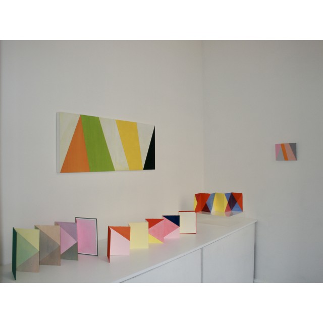
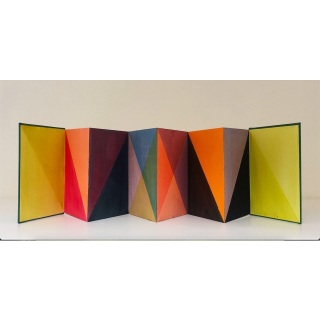
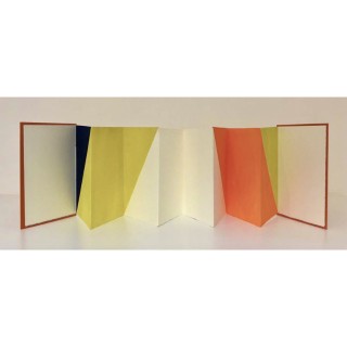
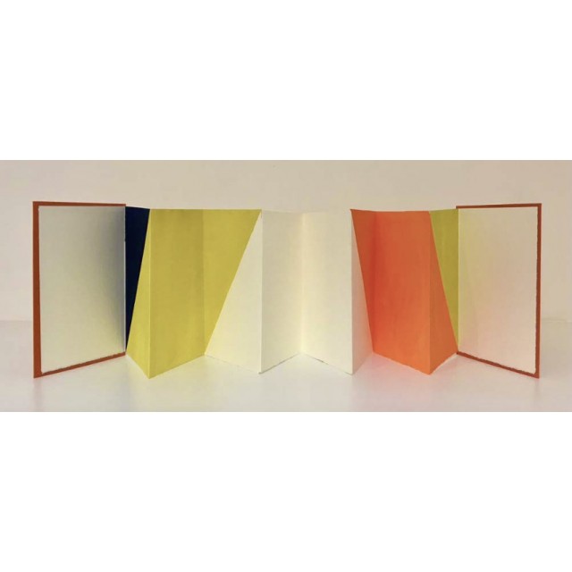
The installation combines a number of Hall’s abstract paintings with a recent series of ‘leporello’ book works, which extend her explorations of colour, light and space, across folded paper pages and into three dimensions.
Hall’s work is distinguished by its subtle manipulations of layered transparencies of paint on supports of gesso panel and linen canvas: ‘Held by geometrical armatures, intense colour bands divide surfaces into sections.Their pulsating planes evoke minute, barely perceptible rhythms that nuance the firm and measurable time invoked by the pictorial architectonic.’ (Kamini Vellodi, ‘Painting and Time,’ Playtime catalogue,Arthouse1,2019)
Whilst working within parameters of a contemporary, formalist language of abstraction, her paintings carry an emotional resonance that refers back to traditions of the quattrocento, revealing how light affects the nuances and poetic qualities of colour.
In 2016 Hall began making folded paper structures that allowed her to experiment with light and shadow, creating optical illusions in relation to the surface of the two dimensional images and the three dimensional space they imply. Using acrylic, watercolour glazes and washes soaked into paper, she threads and weaves enormously sophisticated colour relationships across the zig zag structures.
Emma Hill
2021
Before and After Photography the Journal of Contemporary Painting Issue 7 vol 1 and 2
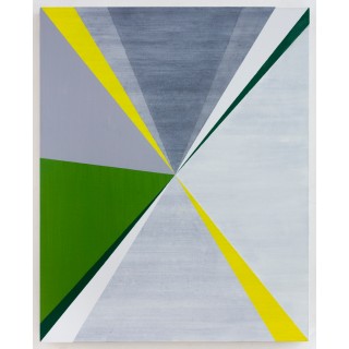
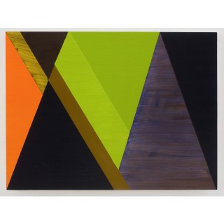
Paintings by Sharon Hall employ a [ ] structure of diagonals that converge without suggesting perspective depth. In Contrapunto (DS) (2018) they radiate from the geometric centre of the rectangle. In Accentata (Blu) (2019) they join the top to the bottom progressing laterally across the painting. The diagonals in In Four (Green, Pink, Ochre, Cadmium) (2019) and In Four (Blue, Yellow, Green, Terra Verde) (2019) connect the left and right sides of painting, marking out four tapering sections each given a different chromatic value. These sections appear as forms, kinetically relating to one another on the same plane. They participate in a space that seems to me to conform to Greenberg’s notion of picture making. ‘Pictorial space joins and contains, and by containing makes everything it shows discontain itself and surrender itself to a unity, which in turn contains itself’ (Greenberg 2003). The dynamism of the angles connecting the verticals creates a tension that is potentially disrupting. If the diagonals had been horizontals each section would be independent or ‘contained’. By using diagonals, the shape of the wedges influences or adjusts to the shape of the adjacent areas. The forms are thus ‘discontained’ to surrender themselves to a unity bounded by the finite area of the picture’s dimensions.
David Sweet
2020
The Diagonal:David Sweet with Sharon Hall #22 Turps Magazine
[ ] sections appear as forms, kinetically relating to one another on the same plane. They participate in a space that seems to me to conform to Clement Greenberg’s notion of picture making. ‘Pictorial space joins and contains, and by containing makes everything it shows discontain itself and surrender itself to a unity, which in turn contains itself.’ The dynamism of the angles connecting the verticals creates a tension that is potentially disrupting.[ ] By using diagonals the shape of the wedges influences or adjusts to the shape of the adjacent areas. The forms are thus ‘discontained’ to surrender themselves to a unity bounded by the finite area of the picture’s dimensions.
David Sweet 2019
David Sweet
2020
Sharon Hall : Three Works X 3
The painterly language that informs Sharon Hall’s works is rooted in the experience and knowledge of how light works in painting. Hall went to paint in Italy in 1990 when she was awarded a Rome Scholarship and it is possible that both her intense feeling for place and the colour language of her mature style come, at least partly, from her experience of Italy and Italian painting. It is not so much the 'correct' chiaroscuro of the high Renaissance that interests her as the poetic-symbolic colour of the masters of the quattrocento, such as Fra Filippo Lippi, and also of the Mannerist, Jacopo Pontormo, that guides her in her quest for that ineffable sense of place that painting can evoke.
The geometrical scaffolding of the paintings is precisely as complex as it needs to be for the colour to do its work. In his essay 'On Colour' from The Salon of 1846 the poet Charles Baudelaire writes: “As the sunlight changes, tones change in value but, always respecting their sympathies and natural antipathies, continue to live in harmony through reciprocal connections.” These words could serve to describe Hall's colour modulations. Tone-colour values are deployed in asymmetrical groups: dark, very dark, light, and very light, together with multiple nuances of warm and cool, strong and weak, that form a contrapuntal relationship with the symmetrical geometry. The geometry is the framework that enables this exchange system to function effectively.
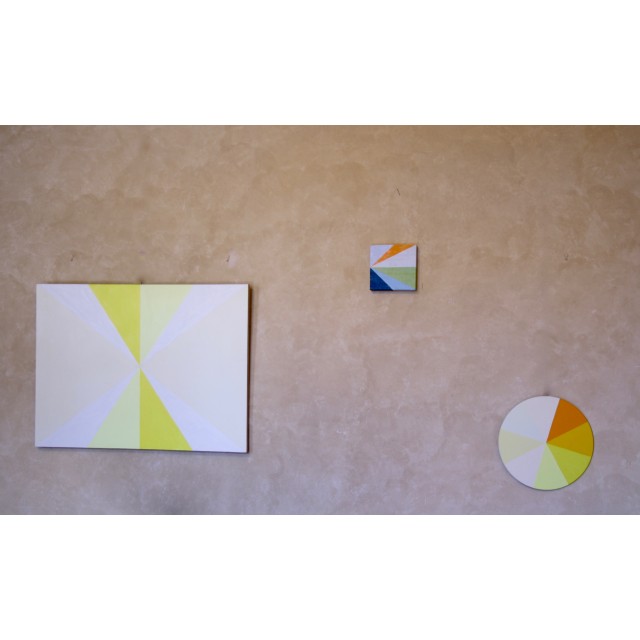
The photograph on the front cover of the catalogue for Hall's solo exhibition entitled Colour in Place in the Palazzo del Podestà, Pescia, Italy in 2013 shows two very small paintings on an empty expanse of wall. Scale is given by the inclusion of a stack of larger paintings face to the wall. It is due to their extreme clarity and economy that these small paintings have a presence out of proportion to their size. To make a very small painting seem large is always felt as a triumph by a painter. Not only is this colour in space – it creates a space.
David Saunders
2019
Painting and Time
[...] it is inorganic regularity that seems to characterise Sharon Hall’s paintings. Held by geometrical armatures, intense colour bands divide surfaces into sections. Their pulsating planes evoke minute, barely perceptible rhythms that nuance the firm and measurable time invoked by the pictorial architectonic.
Kamini Vellodi extract from essay Painting and Time in Playtime catalogue Arthouse1 London 2019
Kamini Vellodi
2019
The Drawing Collective at #21 Abstract Project, Paris 2016
Cet ensemble de peintures et de gouaches, représenté ici dans les photographies, étudie les différentes manières dont les propriétés de la couleur et les structures géométriques simples peuvent travailler ensembles. Il résulte de leur interaction une résonance optique et un décalage de spatialité qui transcendent leur apparence simple. Cette série explore la matérialité physique ainsi que les plus insaisissables qualités de lumière et de translucidité. Elle reflète mon rapport à la place non seulement à travers la manière dont peuvent opérer la lumière et l'ombre dans un cadre architectural mais aussi dans ce qu'elle de mon intérêt pour la couleur ancrée et certaines traditions italiennes de fresques et de peintures murales.
Sharon Hall, translation Vincent Patillet
2016
Eye and Mind #1
Catalogue Essay, Eye and Mind, The Mercus Barn, Mercus-Garrabet, Midi Pyrenees, France 2015
Sharon Hall’s paintings find complexity through colour rather than form, which is to say that a deliberately transparent permutation of geometric form becomes a context for the subtle shifts in colour relationships, that can be further explored as the paintings comprise more than one interchangeable panel. The resolved state of a complete painting is in Hall’s words “found”, through trial and error—the initial structure an adequate, or neutral armature, on which to place colour. Optically, there are also shifts of space that reflect the positive-negative aspects of the structure where there is also a tonal contrast. Take, In Part Sequence (Orange, Yellow, Terra Verde) 2014, in which this constant realignment of the segments of colour is a product of the duration of viewing. The rational construction of repeated triangles connected with a partial and implied grid is counterpoint to the structuring influence of the reduced chromatic range of orange, yellow and green. In, In Part Stacked Painting (Green, Orange, Yellow, White,) 2014, surface incidents from making—the action of a brush as well as characteristics such as absorbency—are all incorporated rather than illuminated. The two part painting, an overall vertical, the upper part of which is horizontal, reflects a duality in its repeated doubling—of two panels, and two pairs of triangles and displays a motion not unlike serial or fugue patterns in musical composition. In Hall’s paintings system and unitary repetition are willingly undermined rhythmically and not relied upon to provide cohesion—they represent a necessary premise that is then exposed to reconfigurations vis-à-vis colour.
David Rhodes
2015
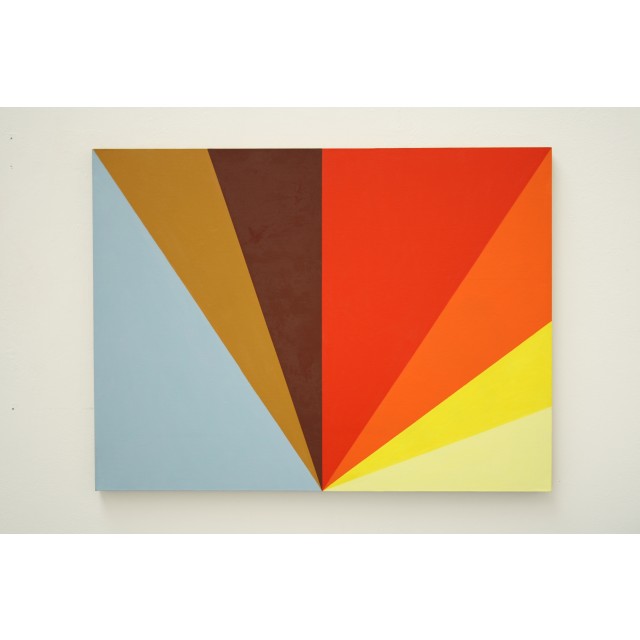
Not Titled (Orange Fan ) COLOUR Boundary catalogue essay
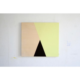
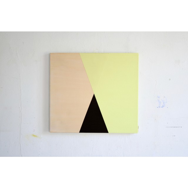
The painting’s structure is based on rational divisions of its surface area, first into two, around the perpendicular centre line, with the resultant pair of rectangles subdivided by diagonals drawn from the top corners to the mid-point of the bottom edge. These simple moves establish what emerges as a gestalt, namely an inverted pyramid, balanced on its apex. But the work is not symmetrical. The right hand triangle is further divided into three more areas that are not answered on the left. These three shapes are perceived slightly differently to those within the pyramid. They seem to move in a one-sided clock-wise movement, adding a dynamic in terms of geometry, which is taken up by the colour, swinging through the spectrum from orange to yellows, deep then pale. The closeness in hue of the orange allows it to hang off the edge of the cadmium red, but the red, which is the key architectural element in the painting, is strong enough to support it.
The surface is consistent throughout, while the density of the pigment confirms that the colour is ‘built’ out of the traditional material of painting, selected from the traditional palette rather than from the refraction of white light arranged around a colour wheel. The geometry is also practical rather than aspiring to the art of pure relationships. Left of centre the ambient chromatic temperature changes. The blue, ochre and umber represent the earth colours ranged against the more luxurious cadmiums, dividing the light in the painting virtually into two seasons. This gives rise to the significant visual experience offered by the painting, created by the contrast between the conditions across the recto/verso axis. It is as though the eye is taking a journey from north to south through several latitudes, sweeping left to right, from grey-blue to pale yellow, before returning to the chromatic and formal hospitality provided by the red triangle.
David Sweet
2014
Colour in Place, The Gravity of Colour
This approach to colour rhythm has been carried over to the current, larger, paintings in a more subtle way. Colours are still grouped into units of two or three, but their arrangement into vertical bands or vertically-orientated shapes, as opposed to tapered beams, not only gives a greater autonomy to individual colours but also creates more of a sense of relative visual space within and between different groups. In addition, the verticality of these paintings appears to relate to an experienced verticality as opposed to the act of simply dividing the surface of the canvas into vertical shapes. It comes from the bodily experience of gravity and as a result the colours now seem to be charged with a weight or density which they previously didn’t have, even as they radiate light.
So, although these paintings are abstract in appearance, they relate to two fundamental facts of human experience: light and gravity. These are not represented but are embodied in visual form through the medium of paint, which gives the paintings their own reality as coloured surfaces within the spaces in which they are displayed. Perhaps an awareness of this relationship between paintings and space develops into a general receptivity to the qualities of interior spaces. Certainly, Sharon Hall has become fascinated by the fusions of light and space, and the subsequent atmospheres – warm, limpid and redolent of both earth and air – in many old Tuscan buildings. I’m reminded here of a quote from Paul Valery which appears in Roland Barthes’ essay about Cy Twombly, ‘The Wisdom Of Art’. “These vast rooms of the Midi, very good for meditation, with their tall furniture looking lost. A great void locked in – where time doesn’t count. The mind wants to populate all this.”
Stuart Bradshaw
2013
The Gravity of Colour
In a group of recent paintings, some of which are quite small and circular in shape, hard-edged beams, or wedges, of colour radiate outwards, sometimes from the centre and sometimes from a corner of the canvas. In several of these works the relationship between colour and light could be seen to be almost graphically represented by the format. These paintings further suggest a temporary stasis in a process of double movement which proceeds both outwards from a point and also moves in a circular fashion around that point, thus emphasising the rhythmic relationships between colours. These relationships heighten the contrasts between colour and light, or tone. Rather than establishing a sense of consistent intervals between individual colours, the paintings generally follow a pattern of grouping two or three closely related, often pale, colours together and then juxtaposing them with a sharply contrasting beam of a very different colour. For instance, a sequence of three successive shades of cream may be followed by a deep crimson. This suggests gradations of light falling unevenly across a wall and then being interrupted by a differently coloured object.
Stuart Bradshaw
2013